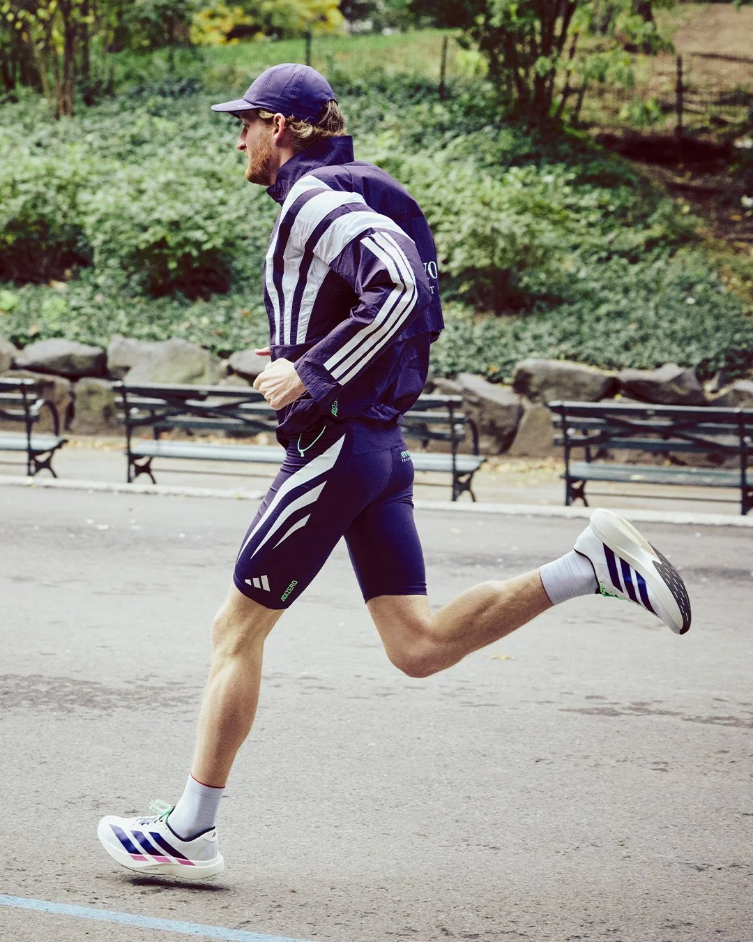
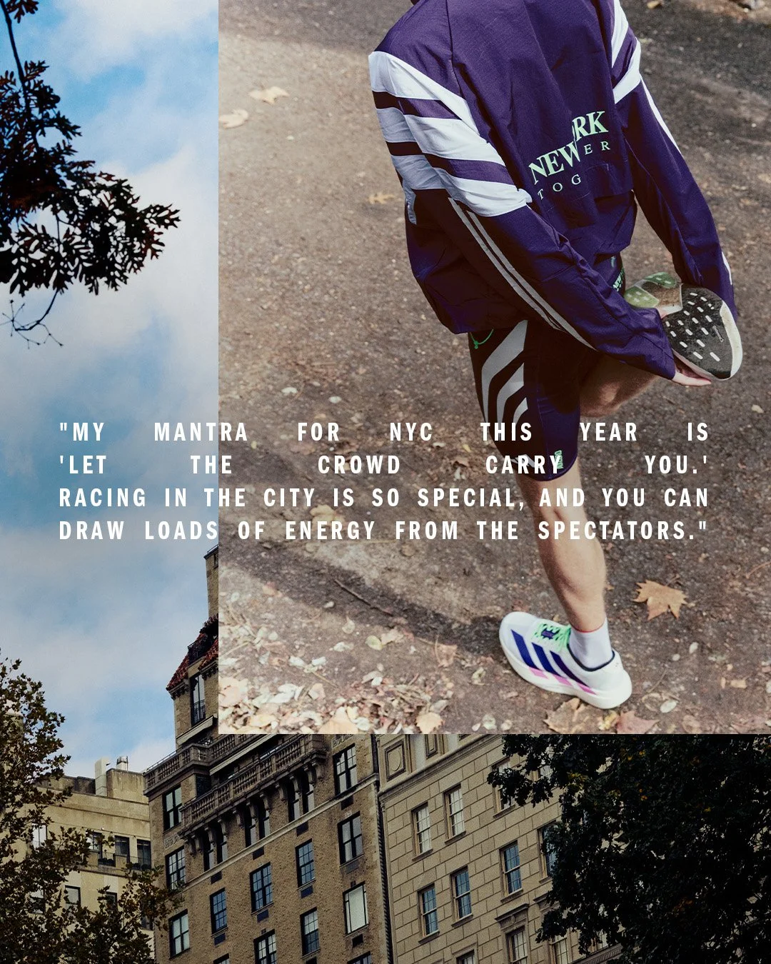
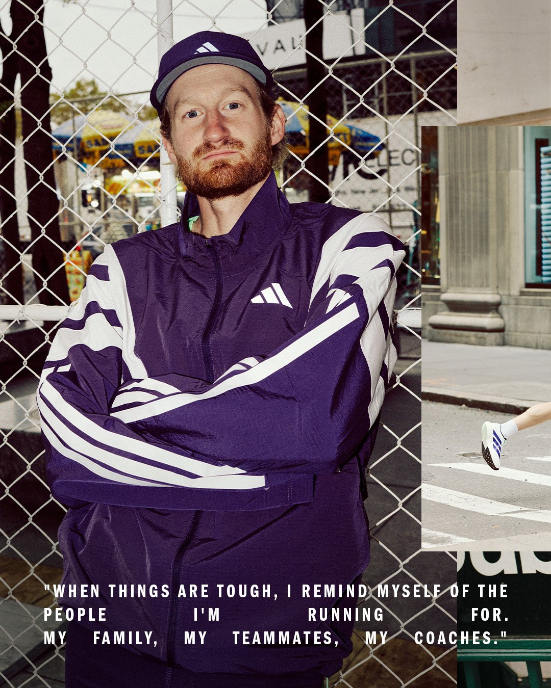
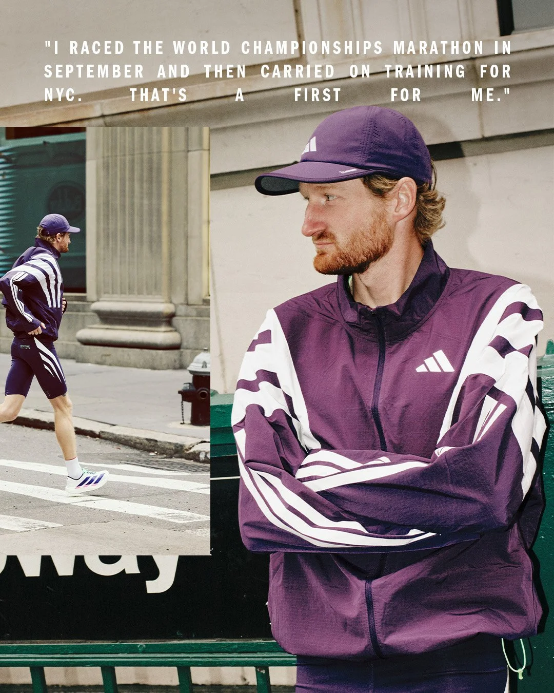
Adidas X Reed Fischer NYCM
Adidas — 2025
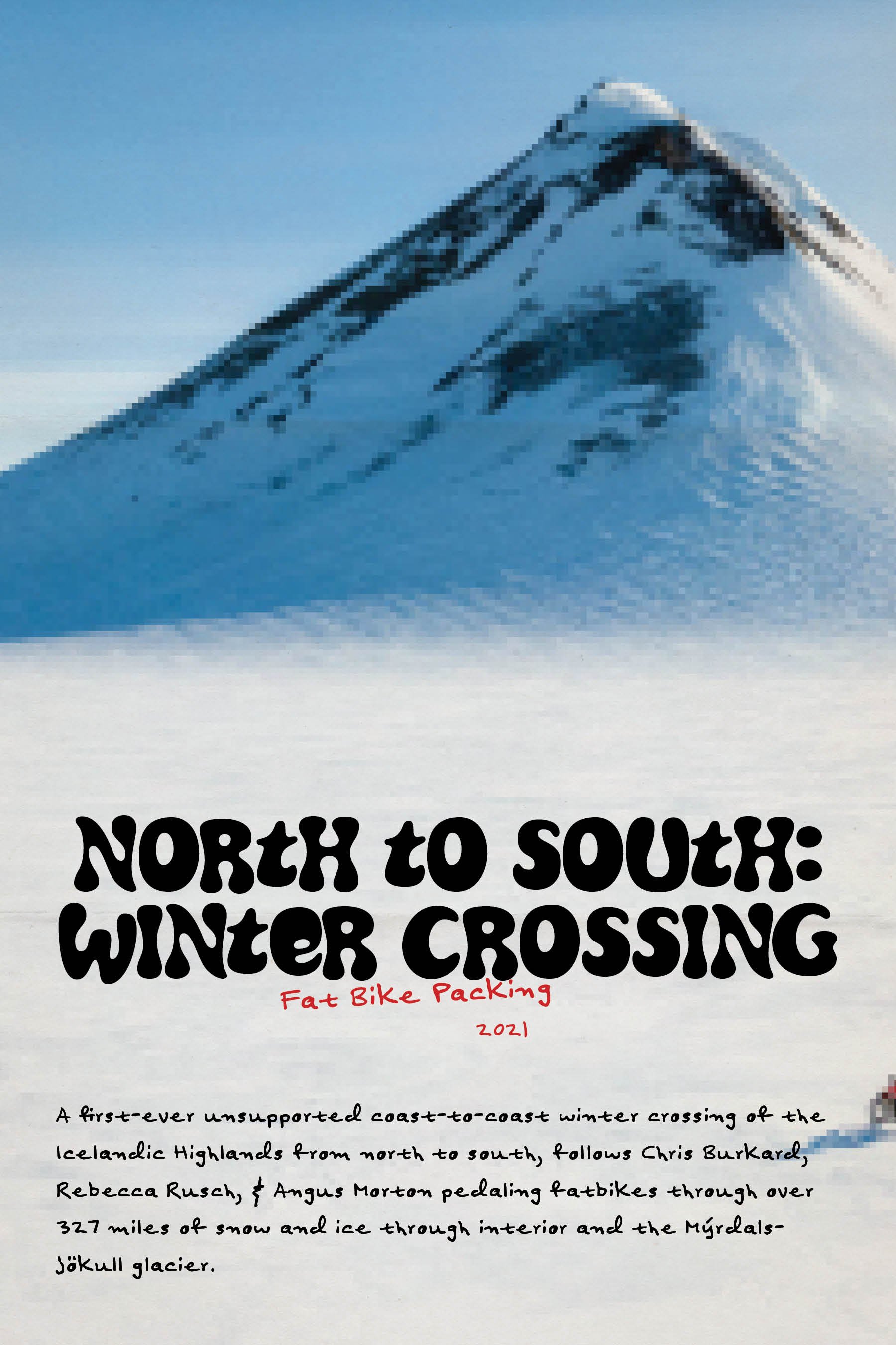
66 North x Chris Burkard
Ljosufjoll Collection Zine
Chris Burkard Studios -2025


Goals:
Chris Burkard and 66°North are launching a collaborative clothing line rooted in exploration, durability, and artistic expression. The zine will serve as a tactile storytelling piece that encapsulates the vision behind the collection, Chris’s personal journey, and the environments that inspire both his work and the gear.
This zine is more than just a product showcase—it’s an art-forward narrative piece that brings the clothing to life through a mixture of photography, written reflections, playful layouts, and strong design. The zine will be distributed in conjunction with the London launch event on April 16 and offers readers a deeper look into the “why” behind the collaboration.
Whether it’s a fold-out poster layout or a traditionally bound zine, the final piece will remain compact, bold, and thoughtfully designed. Expect visual storytelling that reflects the energy of Icelandic landscapes, the durability of 66°North gear, and Chris’s creative spirit—all in a tight 20–25 page format.
Scope:
Zine Design
This includes 3 Revisions/Edits, Typography sourcing, Color Palette Development, Cover Design (including playful treatments like outline-text filled jackets), Visual Look + Feel, Layout Development, Poster/Zine format exploration, Infographic and Quote Highlight Styling, and Full 20–25 page layout (optimized for foldability and readability). Sketching, Mood-boarding, and Ideation are included in the initial design phase.
Imagery
Sourcing photography directly from Chris’s archives and newly captured content, then editing and curating for consistency across the piece. This includes photo editing, treatment design, application of imagery throughout spreads, and ensuring high-res final files are suitable for print.
Content + Copywriting
Incorporates time for collecting quotes, writing light narrative support, crafting bold headers and storytelling snippets, and integrating Chris’s voice and tone throughout. Design element sourcing (such as weather charts, trail lines, or artifact scans) will complement the copy and imagery for a cohesive, immersive feel.
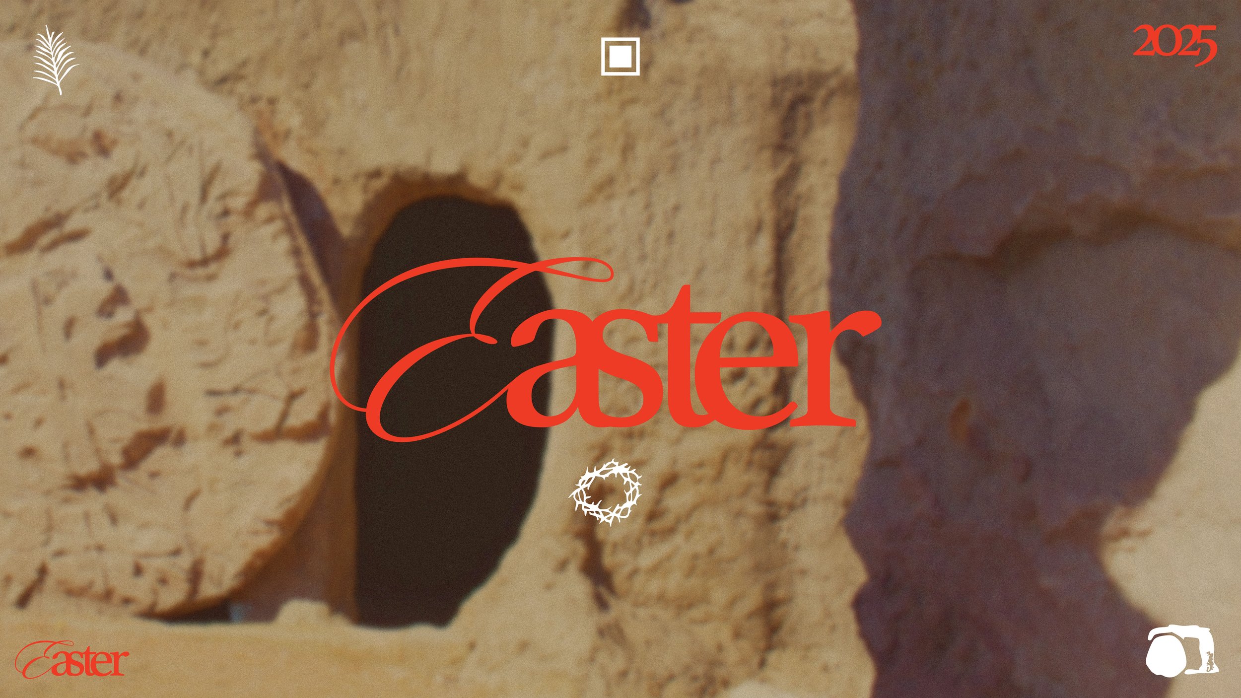
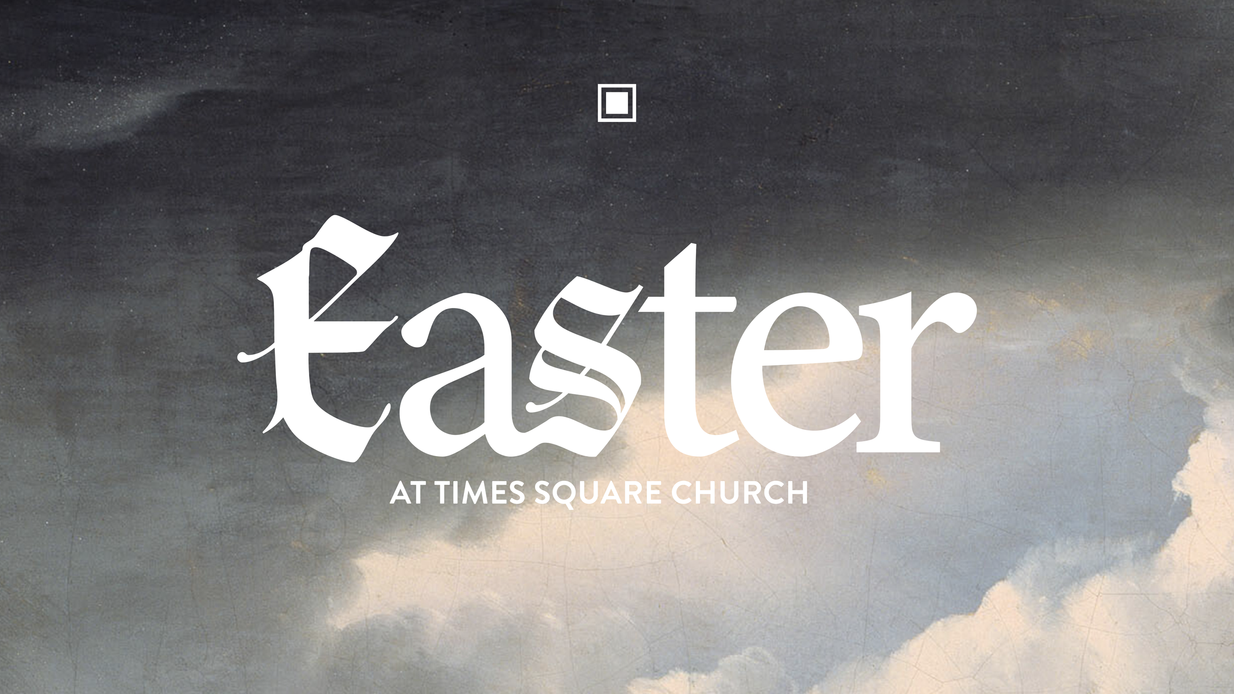
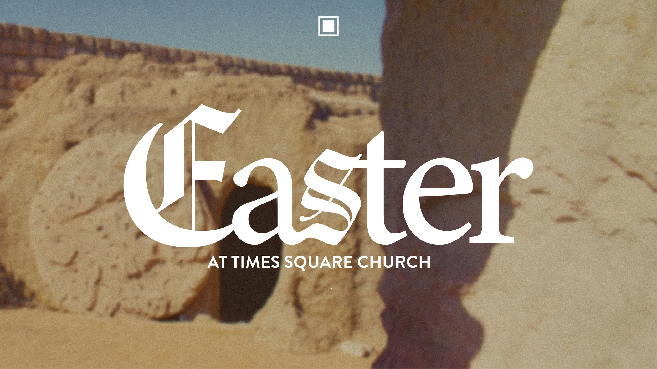
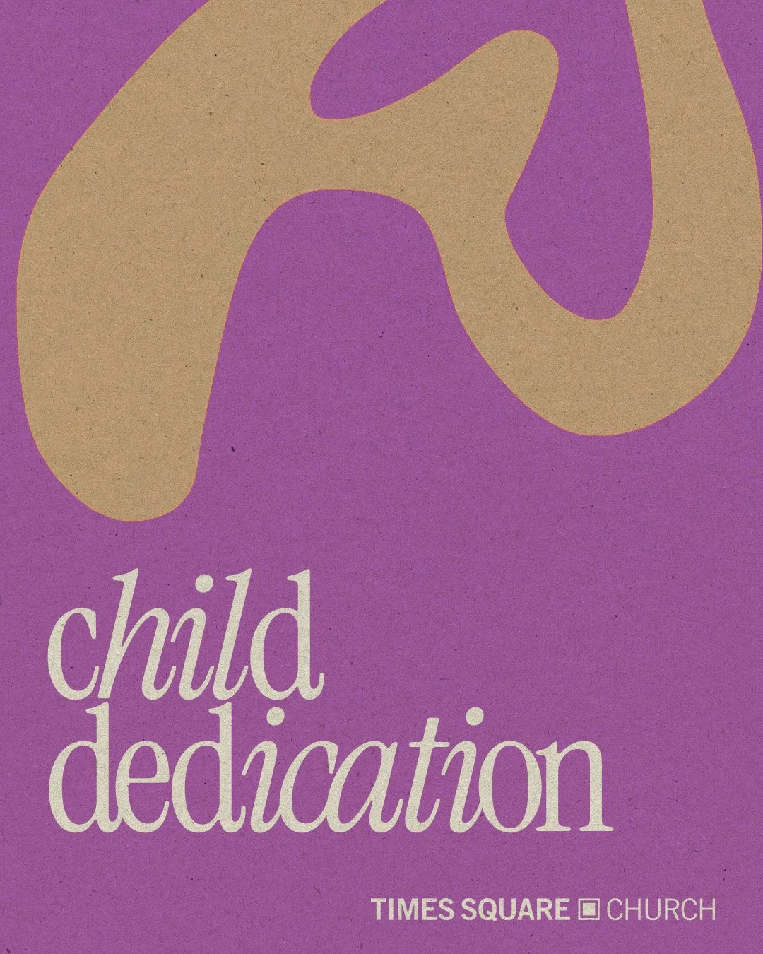
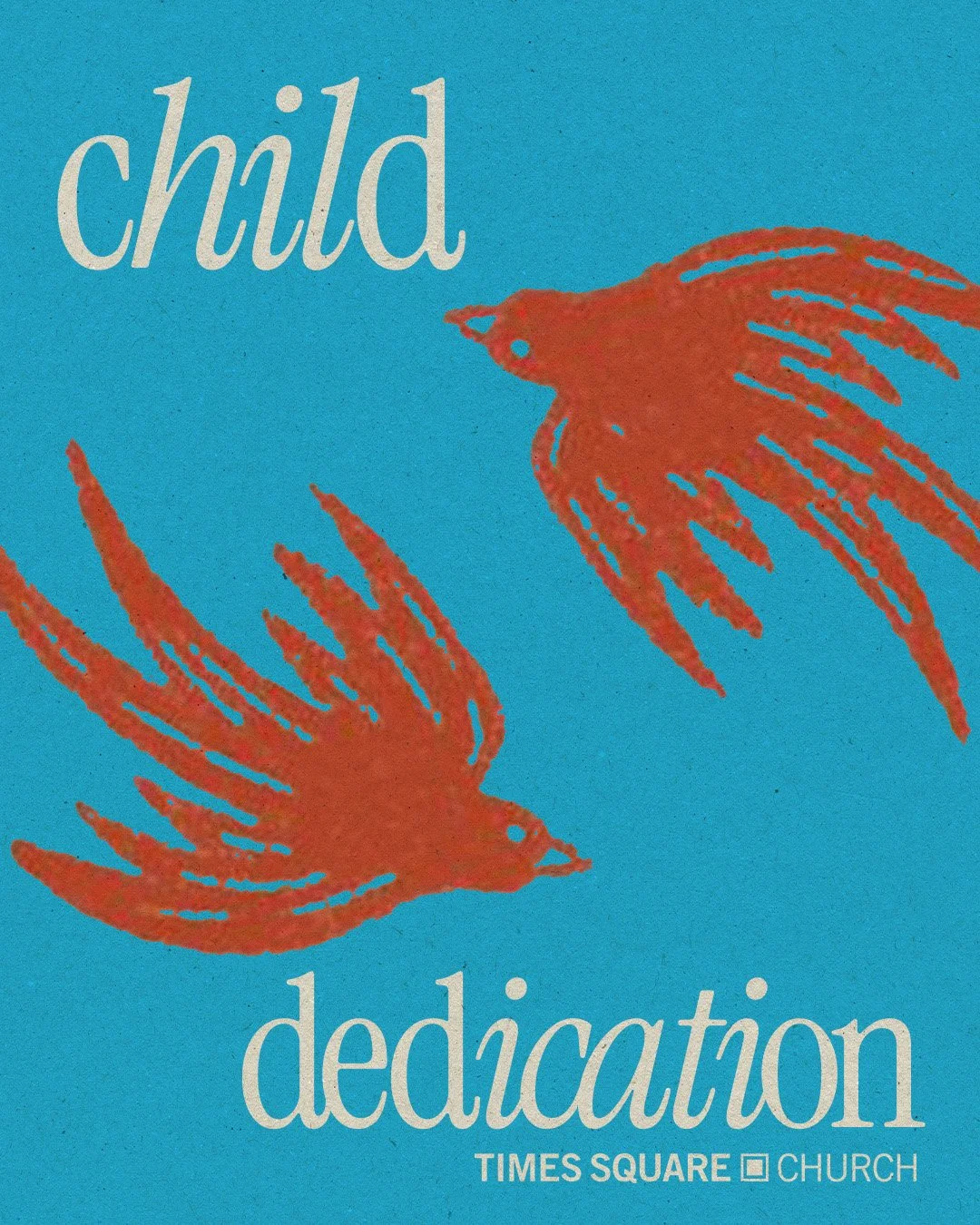
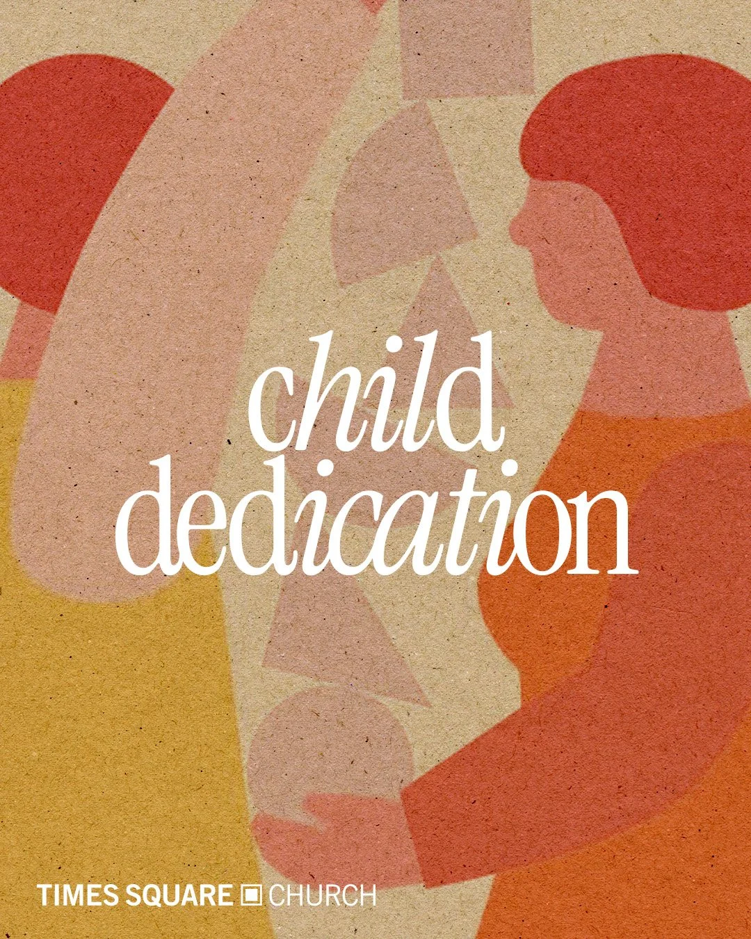
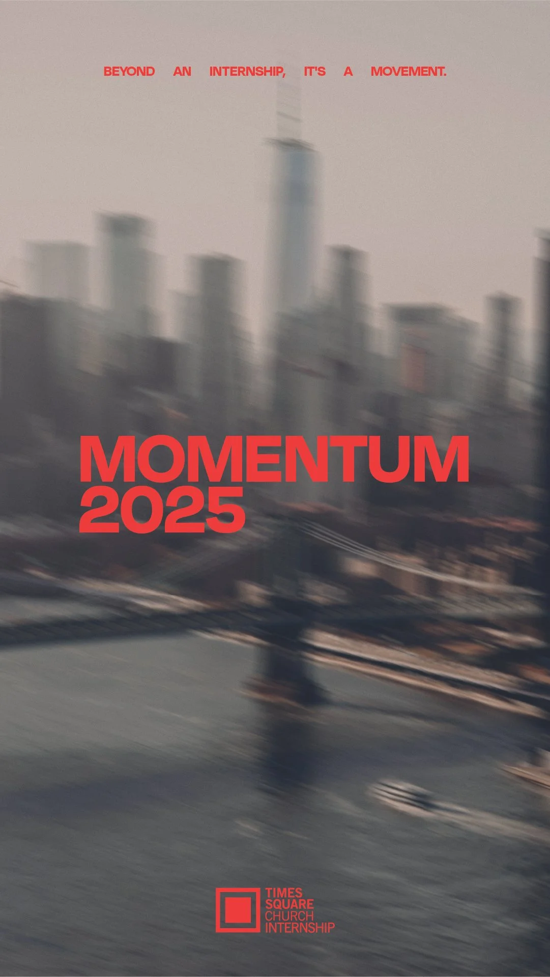
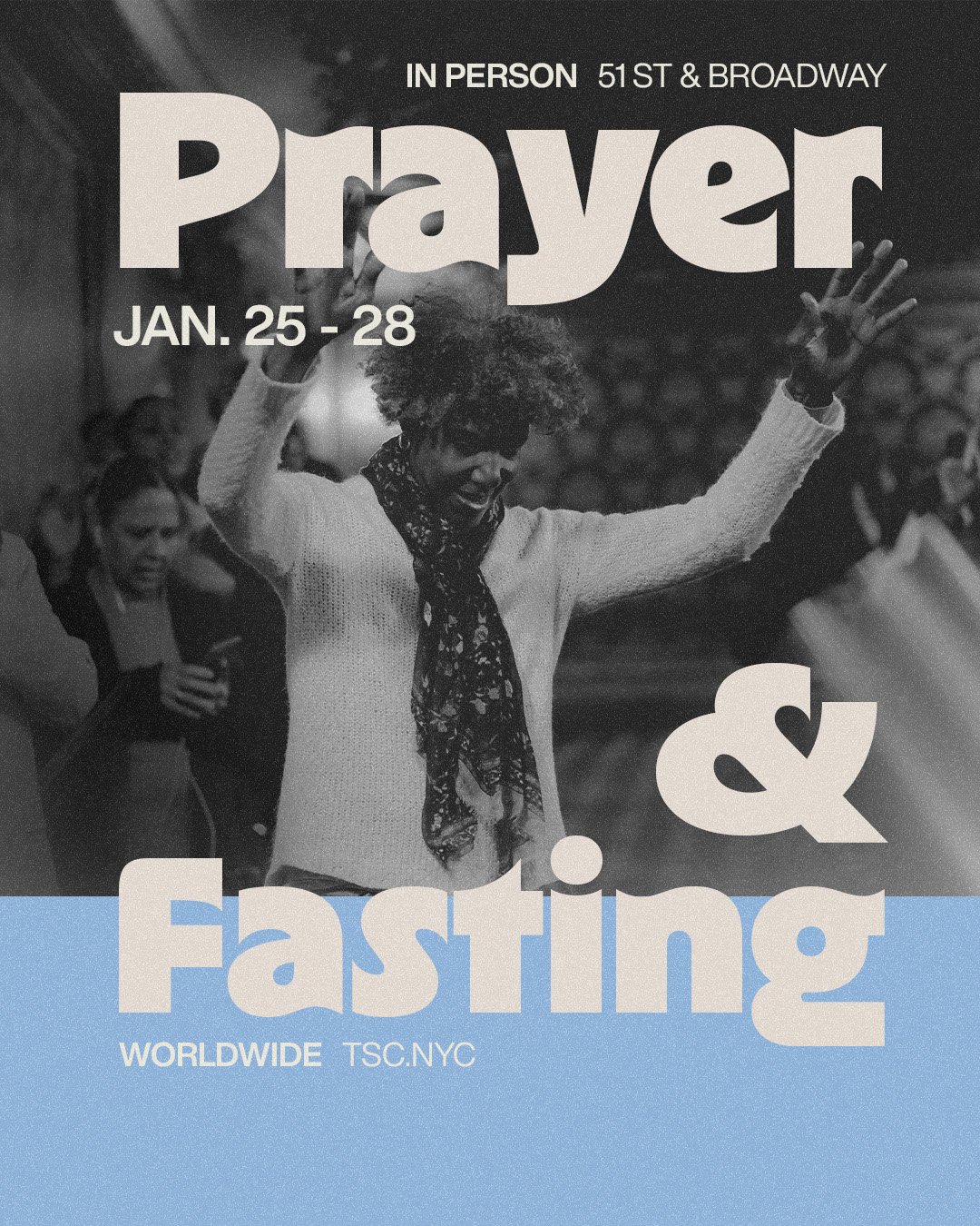
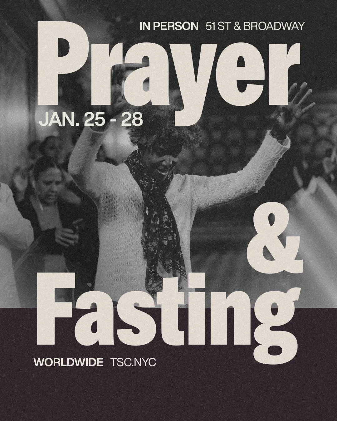
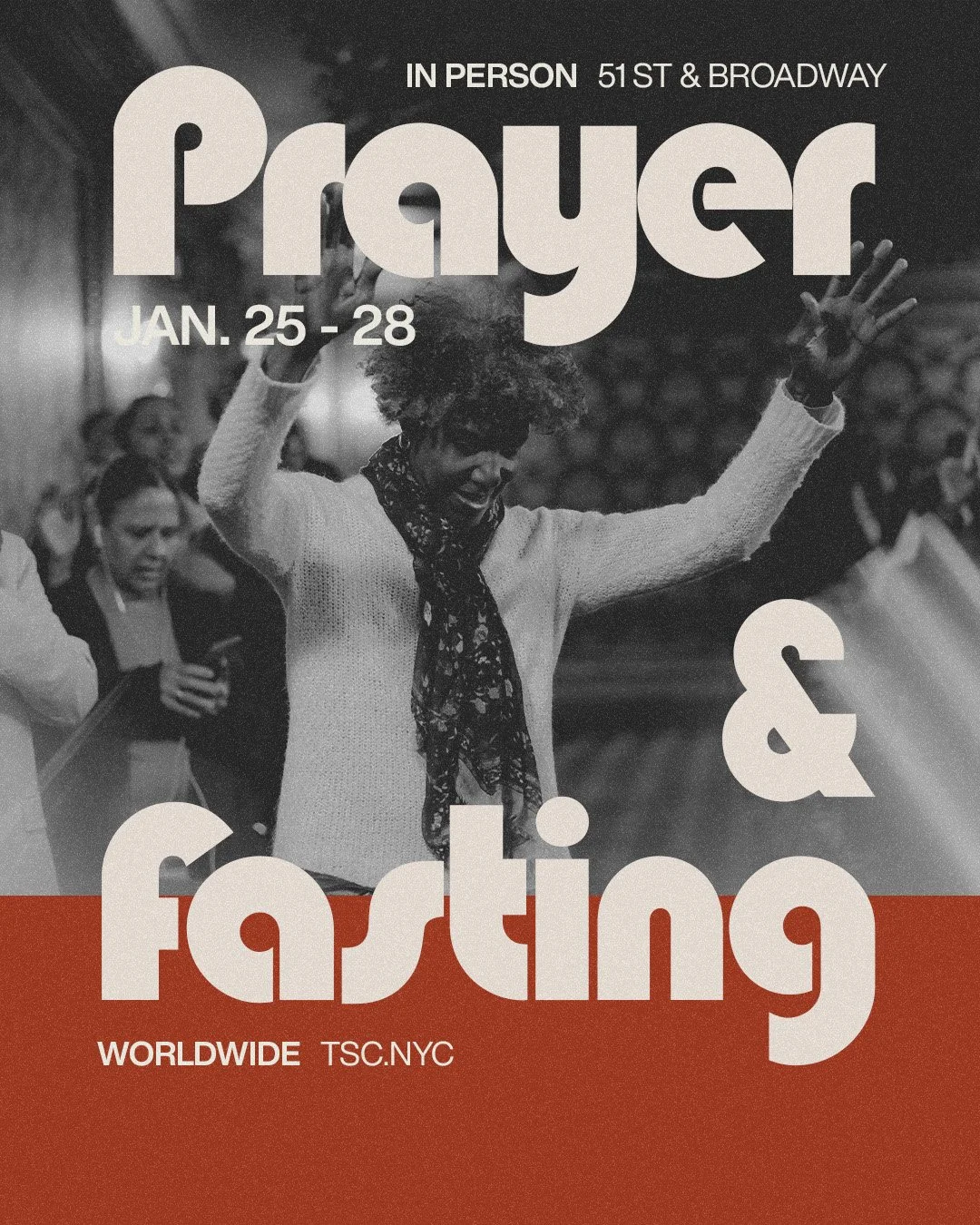
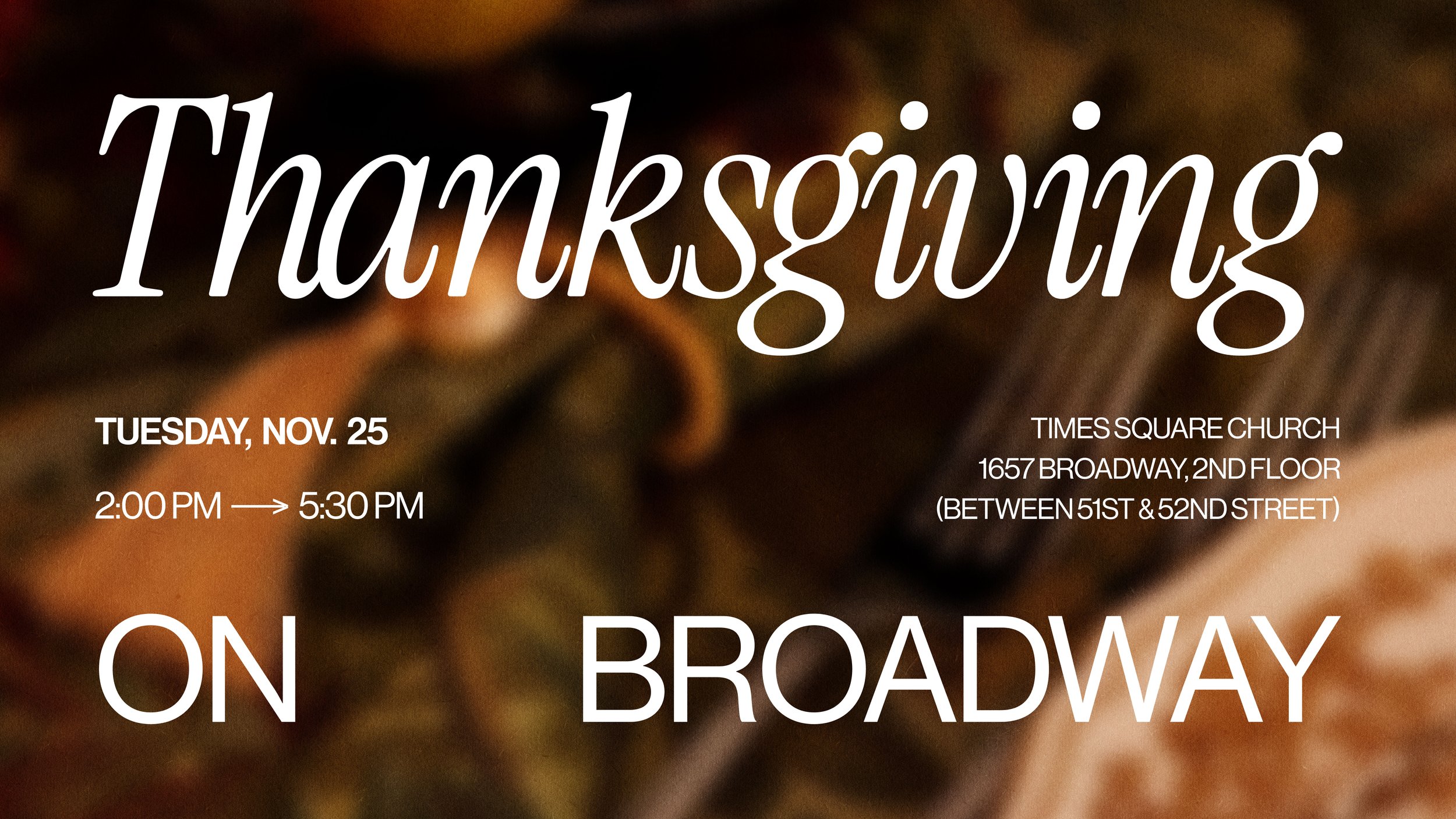
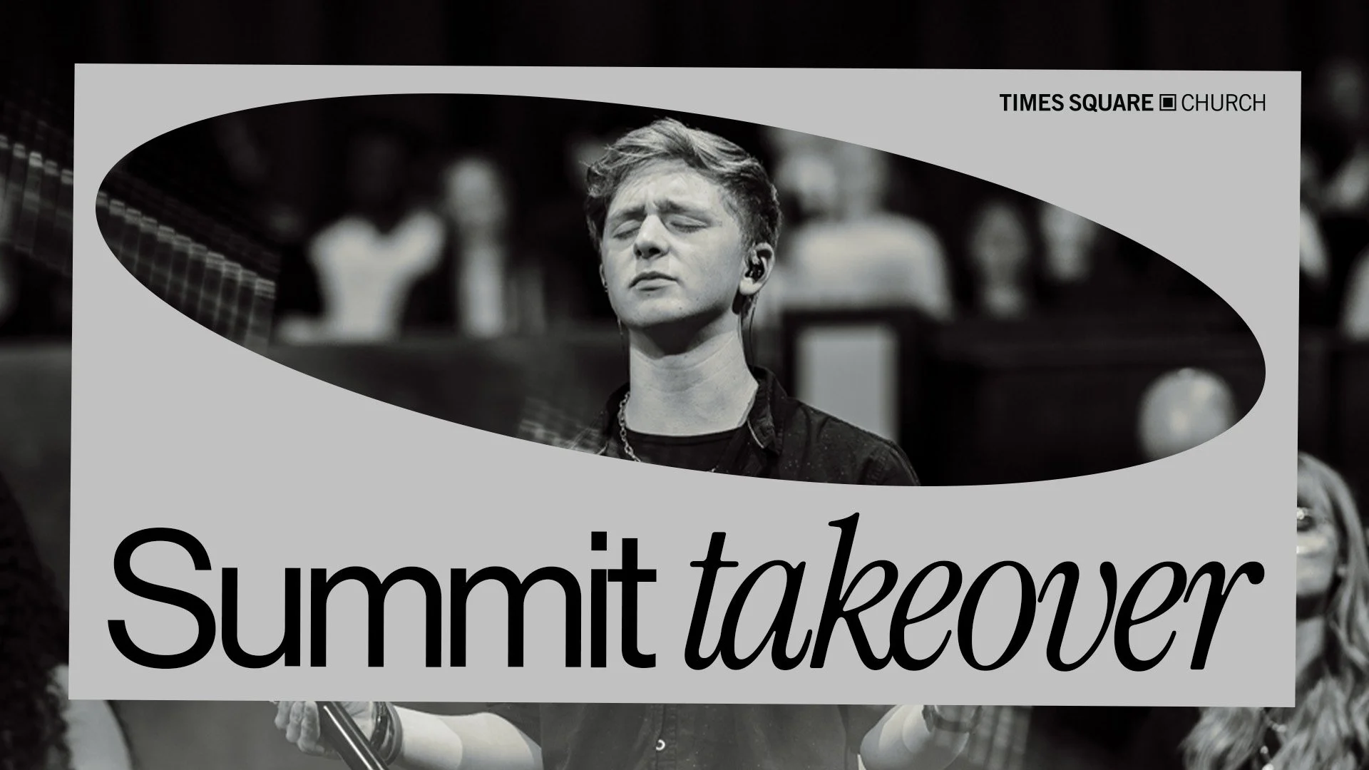
Times Square Church
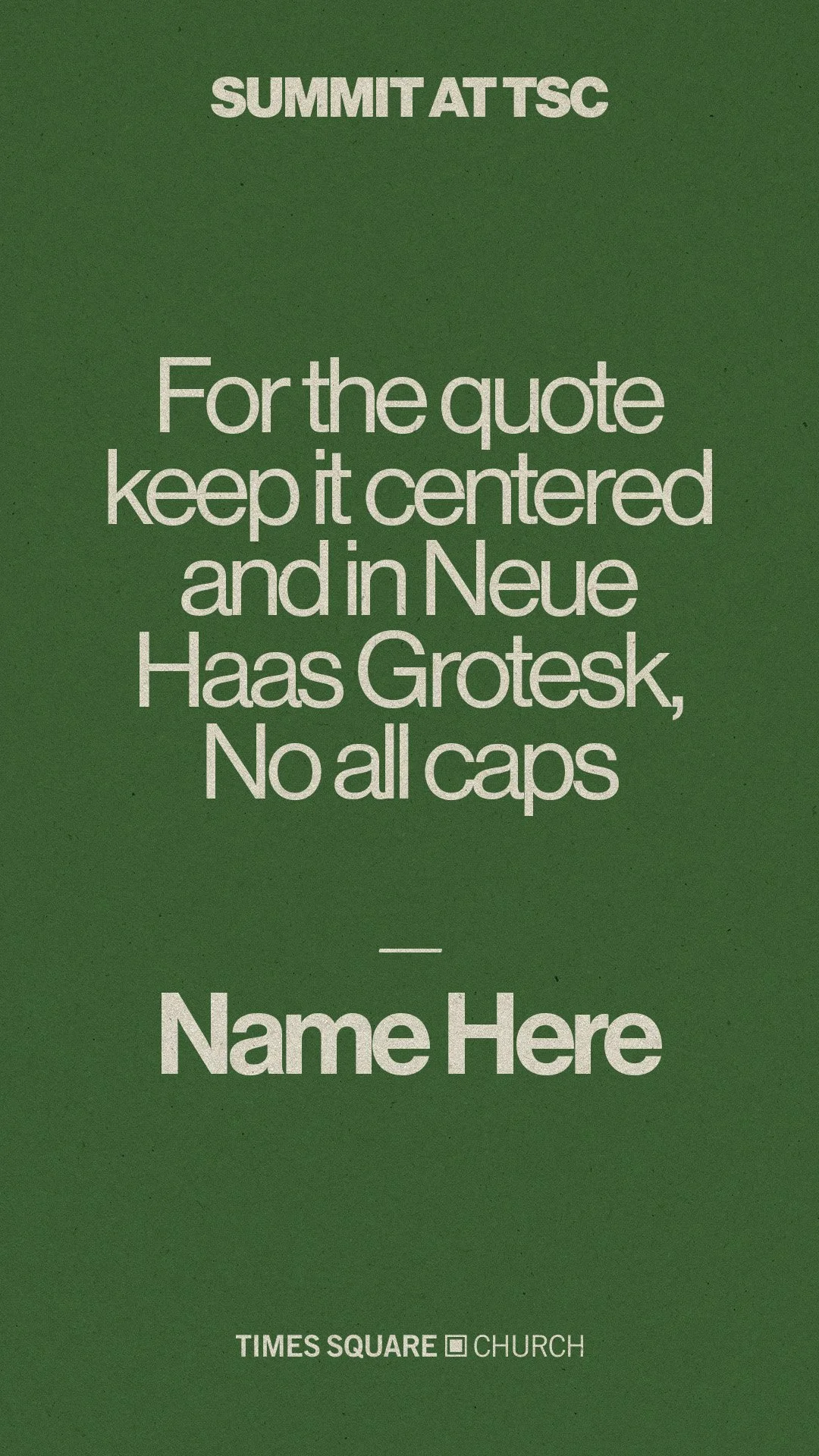
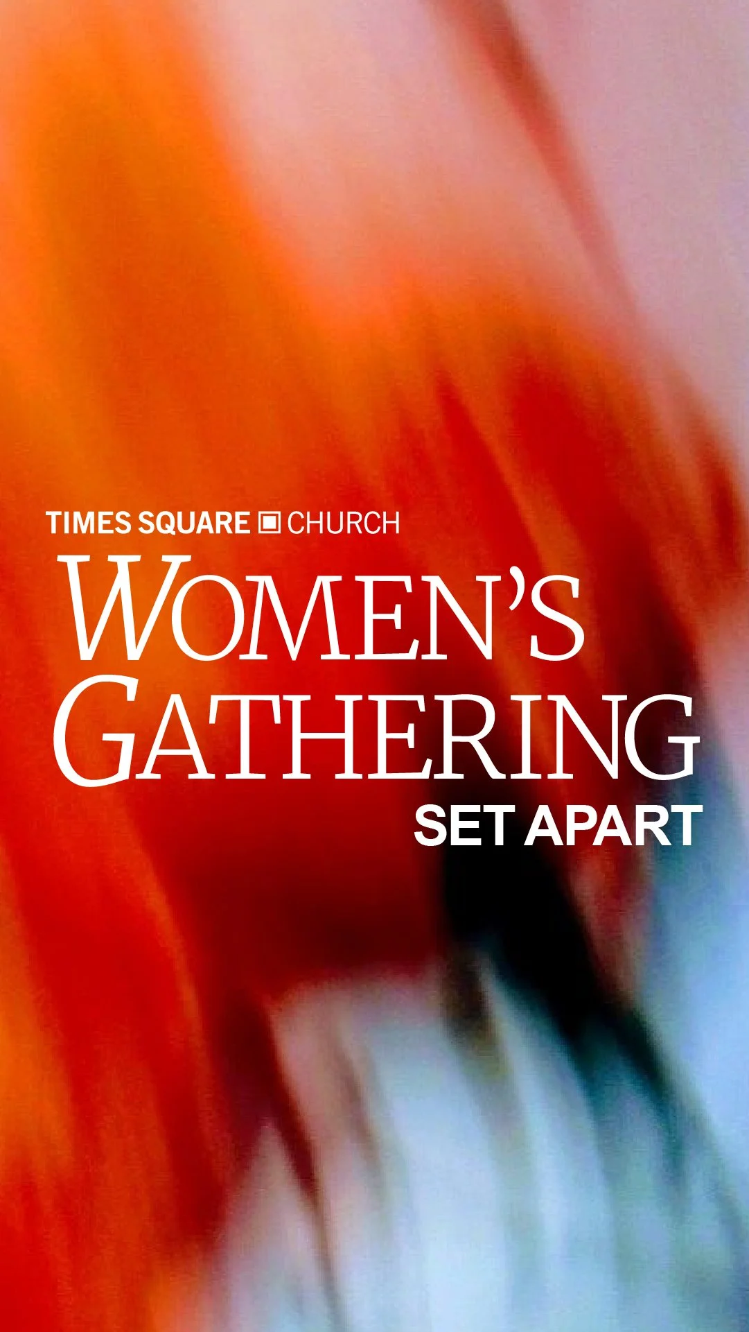
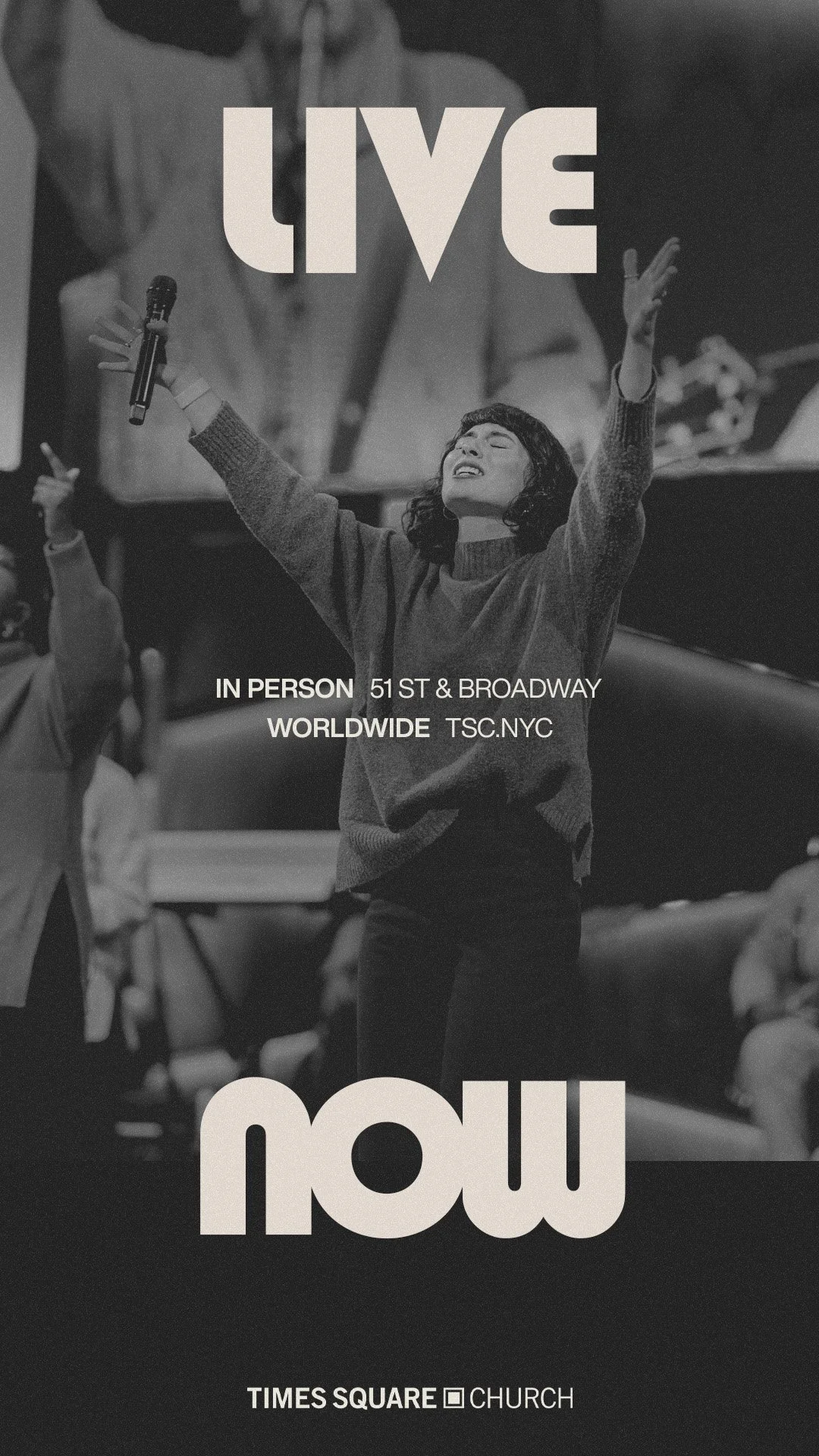
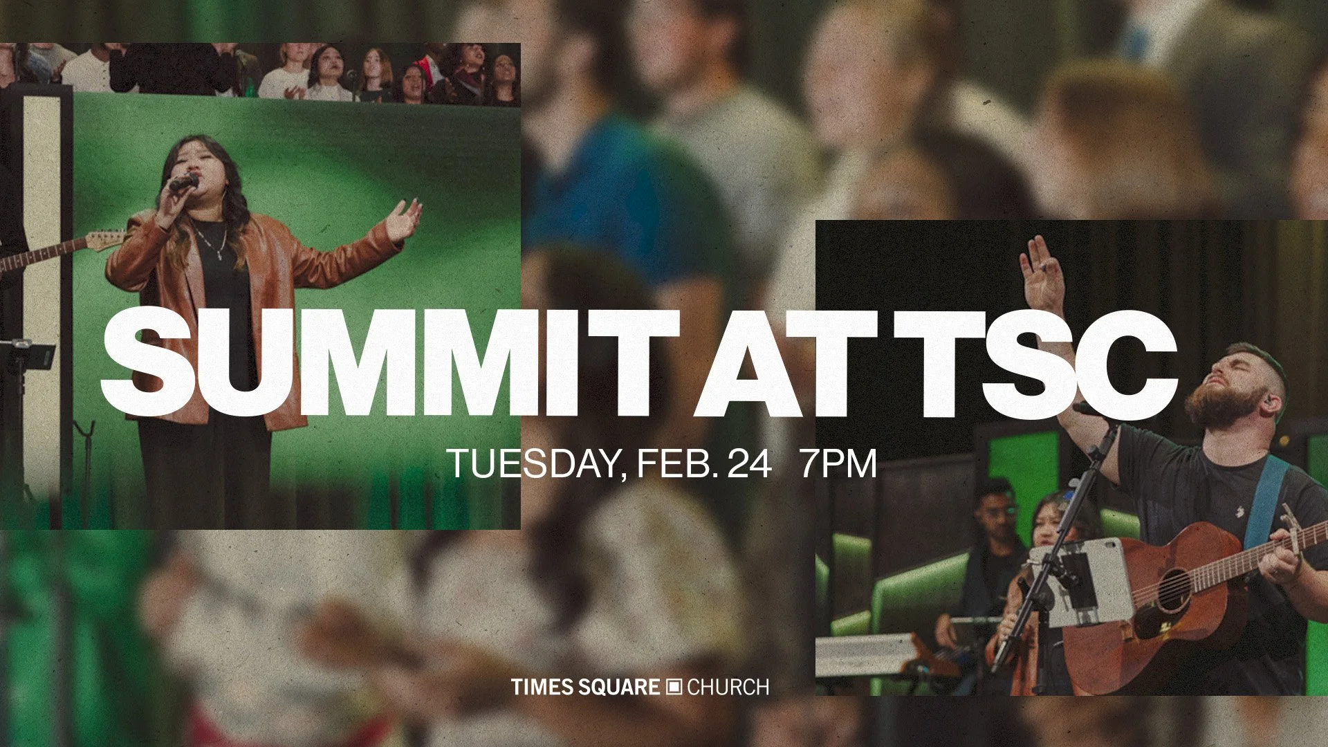
Designed type and graphics for multiple Times Square Church campaigns, including Easter, Thanksgiving, and Game On Sports Camp and more. Each project included complete branding systems with social media graphics, LED wall screen graphics for sanctuary displays, exterior marquee signage for the Times Square location, and print materials such as invite cards and posters.

Andrew Law Productions Branding
2025


Client Overview
Andrew Law Productions is a specialized production company focused on outdoor industry content, particularly wildlife and surfing filmmaking. They provide film production, editing, and production management services for outdoor brands and enthusiasts.
Project Goal
Create a distinctive visual identity that reflects the company's expertise in outdoor filmmaking while conveying professionalism, creativity, and a strong connection to nature.
Deliverables
Multiple logo concepts incorporating outdoor, nature, and filmmaking elements
Final refined logo design with client feedback integration
Custom color palette and typography system
Logo variations for different backgrounds, sizes, and applications
Comprehensive logo style guide with usage specifications
Impact
The logo establishes strong brand recognition in the competitive outdoor industry, positioning Andrew Law Productions as a credible and professional leader. The cohesive visual identity differentiates them from competitors while creating consistent brand presence across all marketing channels, driving client engagement and business growth.


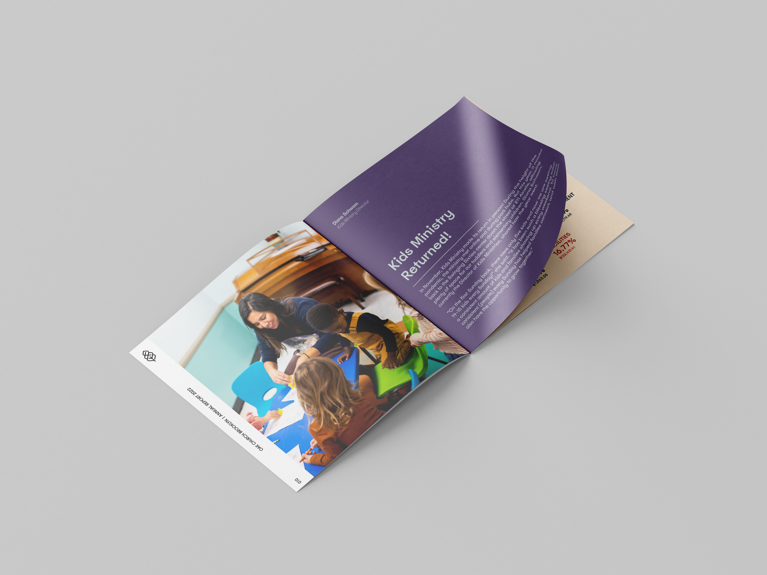
Oaks Church Brooklyn Annual Report
Commissioned Project


Goals:
The Oaks Church cultivates a generous spirit by providing transparency to the church community. The Annual Report shares this spirit, providing its constituents with clarity on finances and the day-to-day happenings in the church.
The Annual Report serves as an opportunity to hear stories about God and what He is doing through this community. Examples of these include the return of the children’s ministry, change in leadership, community groups, and baptisms, to name a few.
The Annual Report will tell the story of Oaks Church’s last year through interviews with church members, infographics that are clear and easy to understand, and photography that reflects the culture of Oaks Church, encapsulated within a beautifully designed 24-30 page book for the community to reflect on.
Scope:
Annual Report Design
This includes 3 Revisions/Edits, Color sourcing, Typography, Look and Feel, Cover, Application of Visual look, Diagram and Chart design, Photo and Content placing, 24-30 page layout, Sketching, Ideation process, Mood-boarding, and Design elements.
Imagery
Capturing photos and the time to take the photos + time for editing, sourcing photos, and re-editing to make cohesive in design, and design application of photos.
Interviews + Content Sourcing
Time is taken to interview and edit the transcription, read through the content, research, design element souring, contract, and proposal
Yardy World
Yardy World


Color Vault Merch Design


For this project a very brief description was given; we’re looking for one design to put on a tee shirt, preferably cream/natural but can also be used on white as well. Some examples and mood boards were sent. Above is the mockups given to the client.
ST. Cloud & Co Logo Design

For this logo design, I was tasked with creating a logo and logo mark for St.Cloud & Co. a hospitality and baking company based in Virginia. The logo and logo mark were inspired by the house of the owner of the bakery and hospitality company, pictured above. WIth the rounded and pointed archway of the house, it was a perfect container for the secondary logo and the recreation of the house logo design.
Spec Projects
Daydream Burgers & Fries
Daydream Burgers & Fries
Client: Spec Project - Project: Branding and Collateral
Dream it
~~
Dream it ~~
The Cure Soda Company
Client: Spec Project - Project: Branding, Collateral & Product Design
The Art of the Soul
Client: Spec Project - Project: Museum Exhibit, Branding and Collateral
Art of the Soul
—
Art of the Soul —

Stylized illustration of a woman lying on her side, wearing purple pants and a light pink sweater, with a yellow sun in front of her face, set against a dark purple background. The text 'after hour clothing co.' is written next to her.

Illustration of a person lying down with a pillow, sunglasses, and a hat, with text partially visible in the background.

Illustration of a person in a purple outfit and sneakers aiming a bow and arrow at a large yellow circle, with the partial word 'af' in white cursive text in the background.

A book titled 'The Gatherer in the Rye' standing on a surface with a large rock next to it, against a plain light background.

An open book with white pages resting on a light gray surface, showing text on both pages.

A book titled "The Catcher in the Rye" by J.D. Salinger leaning against a rock with a plain, light-colored background.
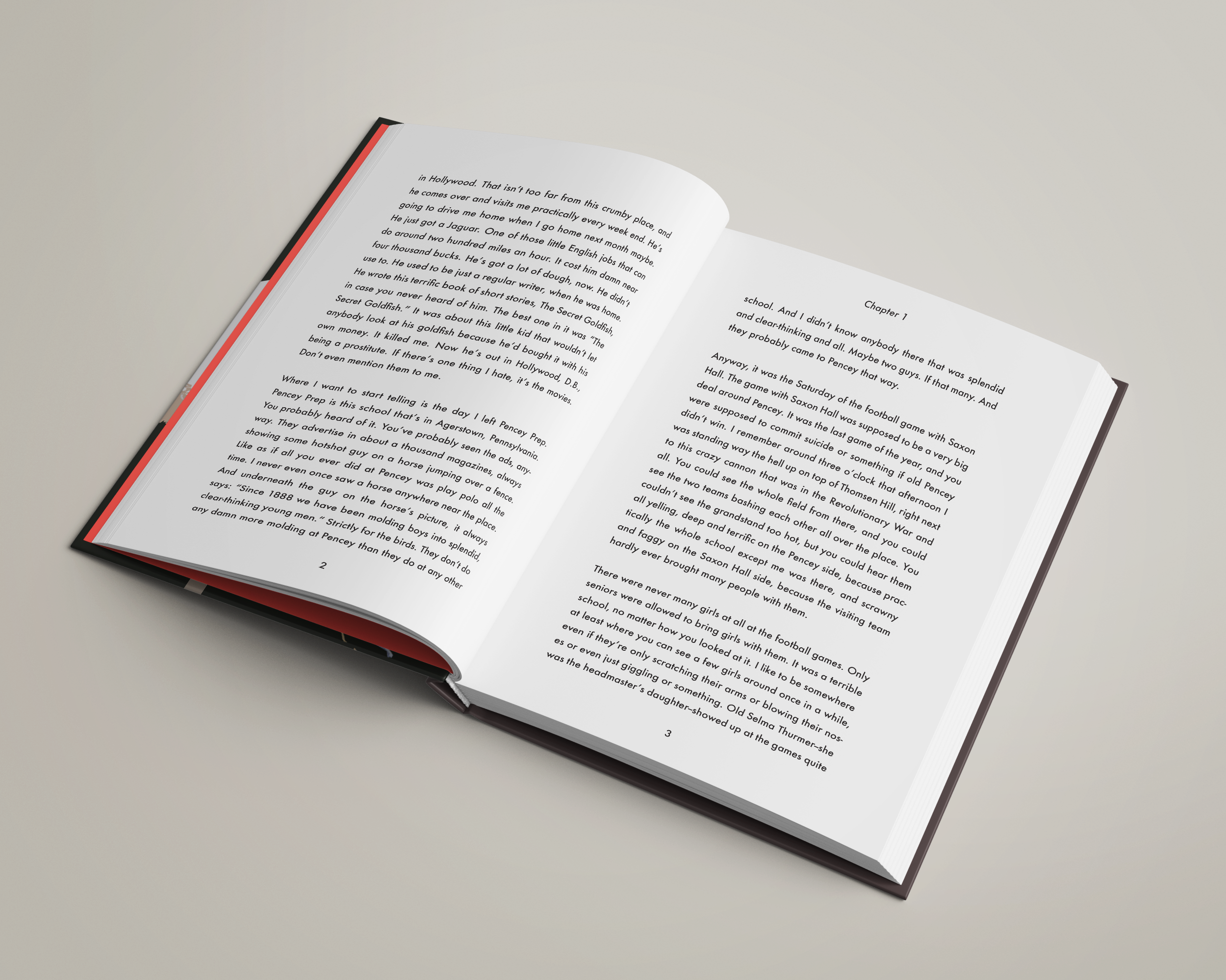
Open book with text on white pages, resting on a light gray surface.

A book titled 'The Catcher in the Rye' leaning against a rough stone on a white background.

Open book on a plain, light-colored surface with visible text and a highlighted section.

Diagram of six different home furniture lighting setups, each within a circle, labeled as white chair, couch, lawn chair, stool, bench, and comfy chair, with various furniture and plants depicted in each.

Interior scene with a white chair with wooden legs, a large potted Monstera plant with large green leaves, a wall lamp casting light on a pink wall, and a gray floor.

A stylized illustration of a living room corner seen through a camera viewfinder, showing a pink armchair, a potted plant, and a ceiling lamp against a dark wall.